IDENTITY DESIGN: FEATURED BRANDS


For nearly three decades, Eric has designed visual identities for corporations, nonprofits and initiatives. With a BFA in graphic design from the Rhode Island School of Design, Eric began his career as a staff designer at top agencies in New York and Los Angeles and continues perfecting his craft to this day, helping organizations express their core values through a unique brand identity. This offering includes meaningful team building workshops, deep discovery, and a comprehensive guide for launch.
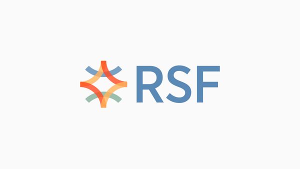
Regenerative Social Finance
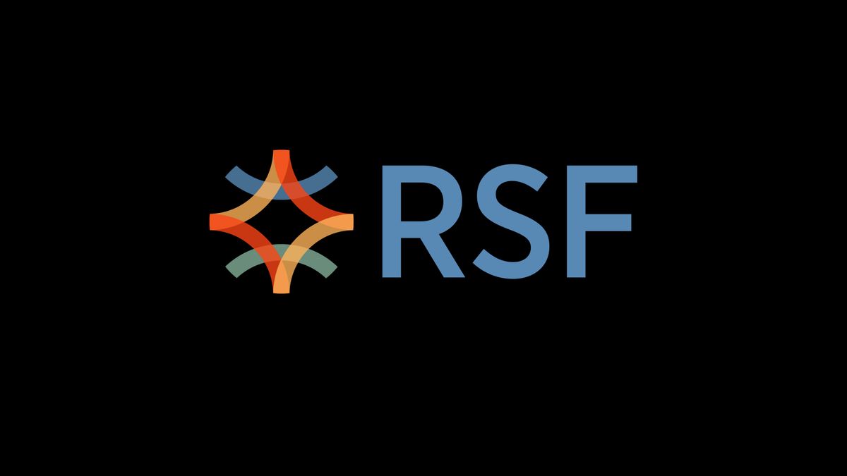
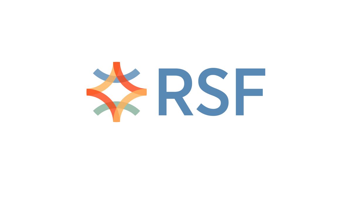
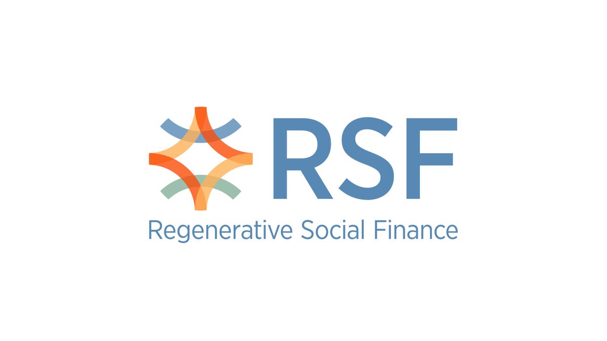

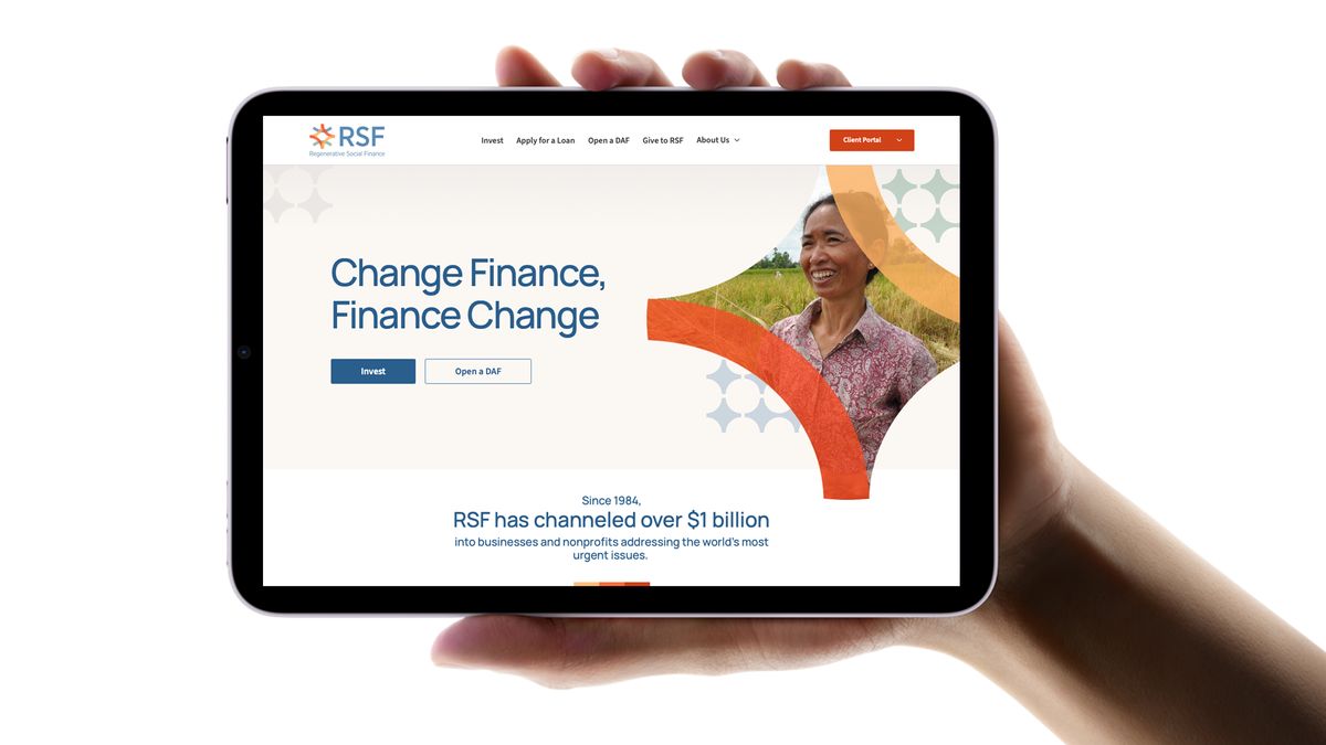
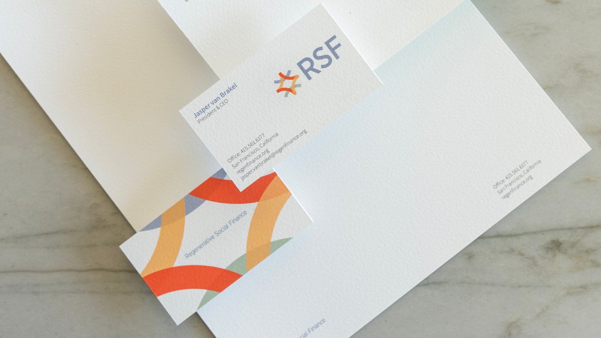
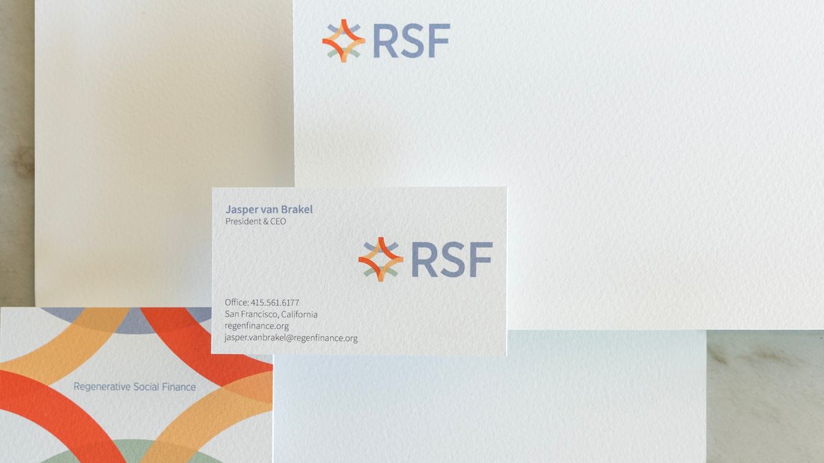
Regenerative Social Finance is an impact-first financial services organization revolutionizing the meaning of money. RSF envisions a world where all people have the power to use their money to regenerate people, communities, and the planet. Eric created the organization’s new identity “Interconnectedness” which utilizes a woven transparent burst as a metaphor for innovation and ideas. The main form is the Kanji shape for human which has been duplicated and repeated to reference a community. This burst is intertwined with line work that stands for earth and sky – people working together in harmony for a healthy environment and a better world.
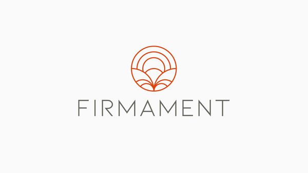
FIRMAMENT
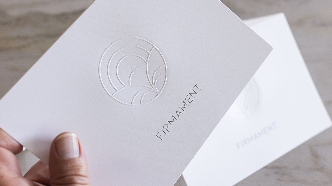
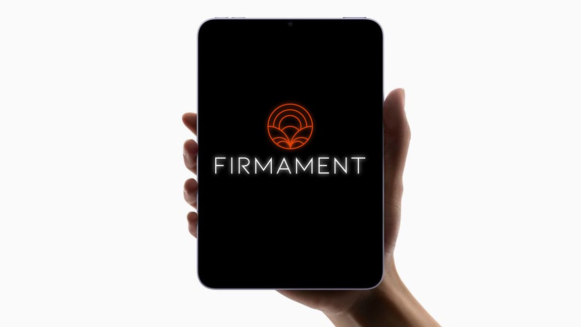
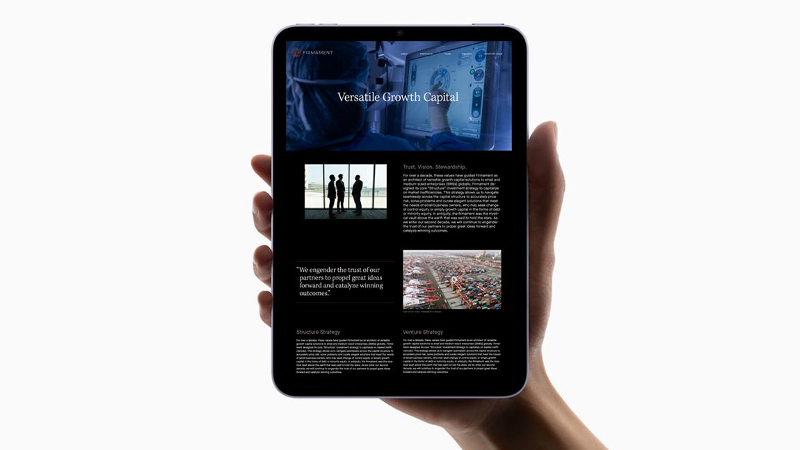
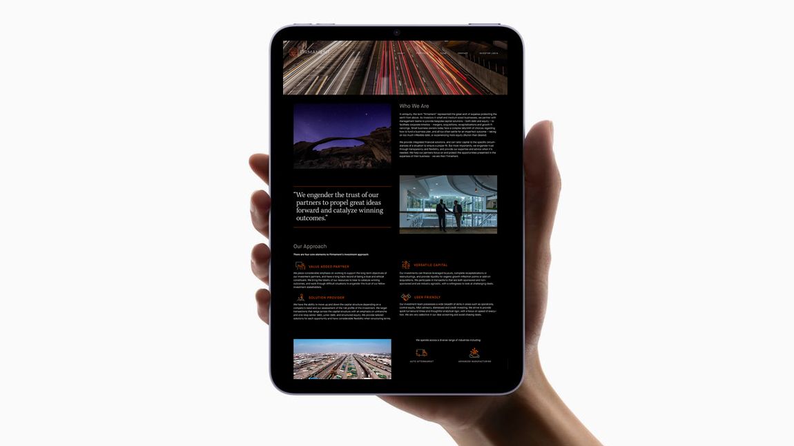
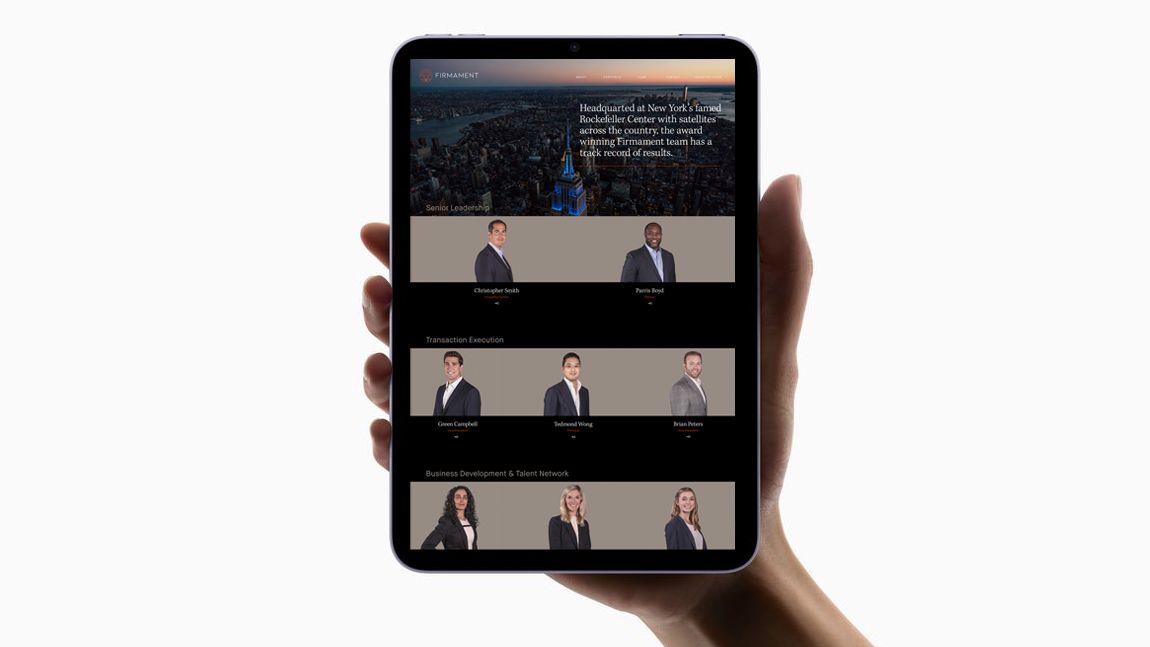
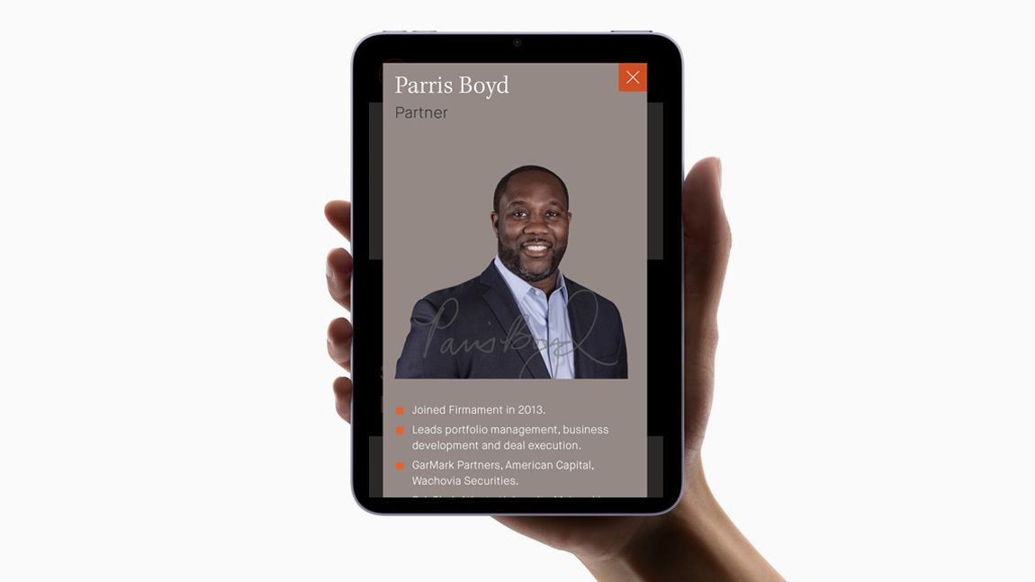
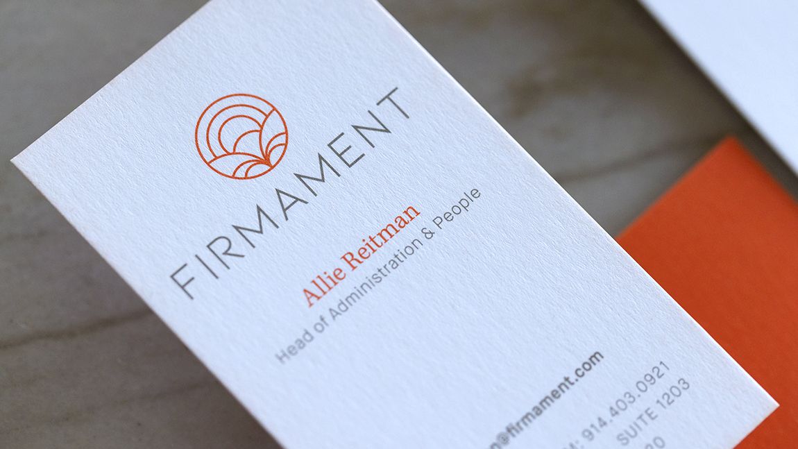
Firmament is a New York-based Private Equity Firm that invests in businesses to improve critical sectors of the US economy. Eric designed the company’s new symbol, a visual expression of the firmament – the heavens or the sky, especially when regarded as a tangible thing. Eric also designed the corporate website, photographed the staff for their biographies and directed video case studies to illustrate the Firmament business case.
FIRMAMENT VALUES POSTERS
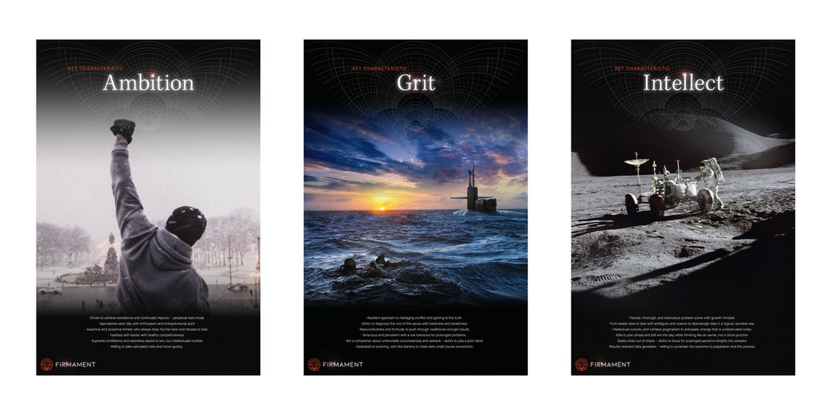
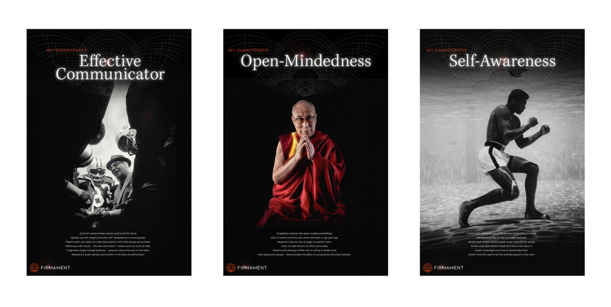
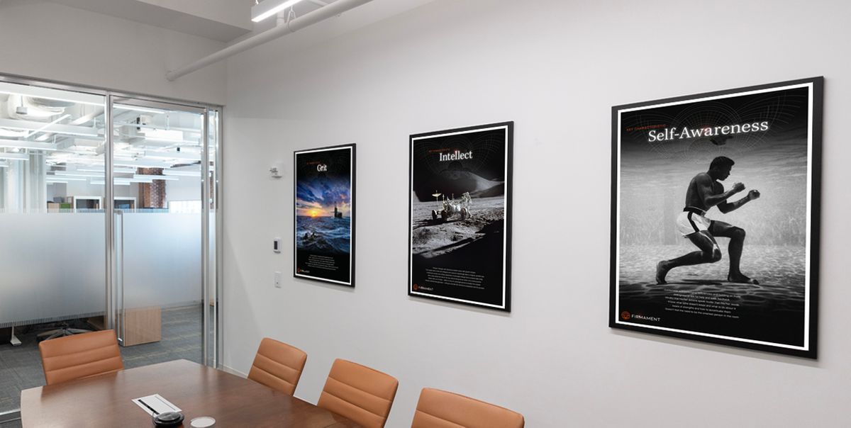
Eric created a series of posters for Firmament's New York headquarters in Rockefeller Center. Utilizing iconic and historical imagery, the set celebrates key values that employees of the firm espouse as well the visual tenants of the Firmament brand.
FIRMAMENT EVENT BRANDING
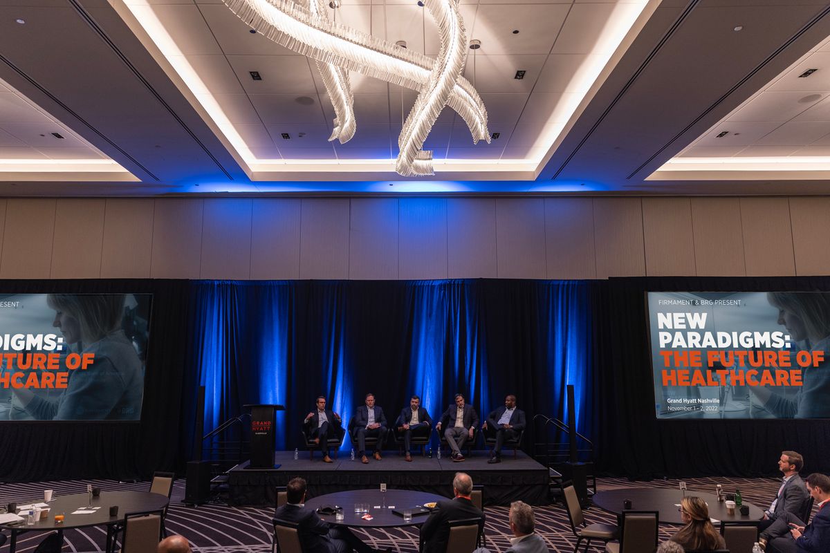
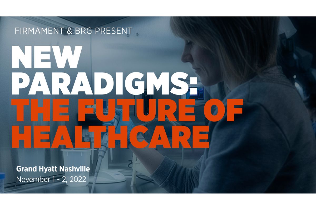
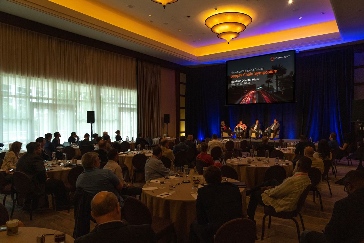
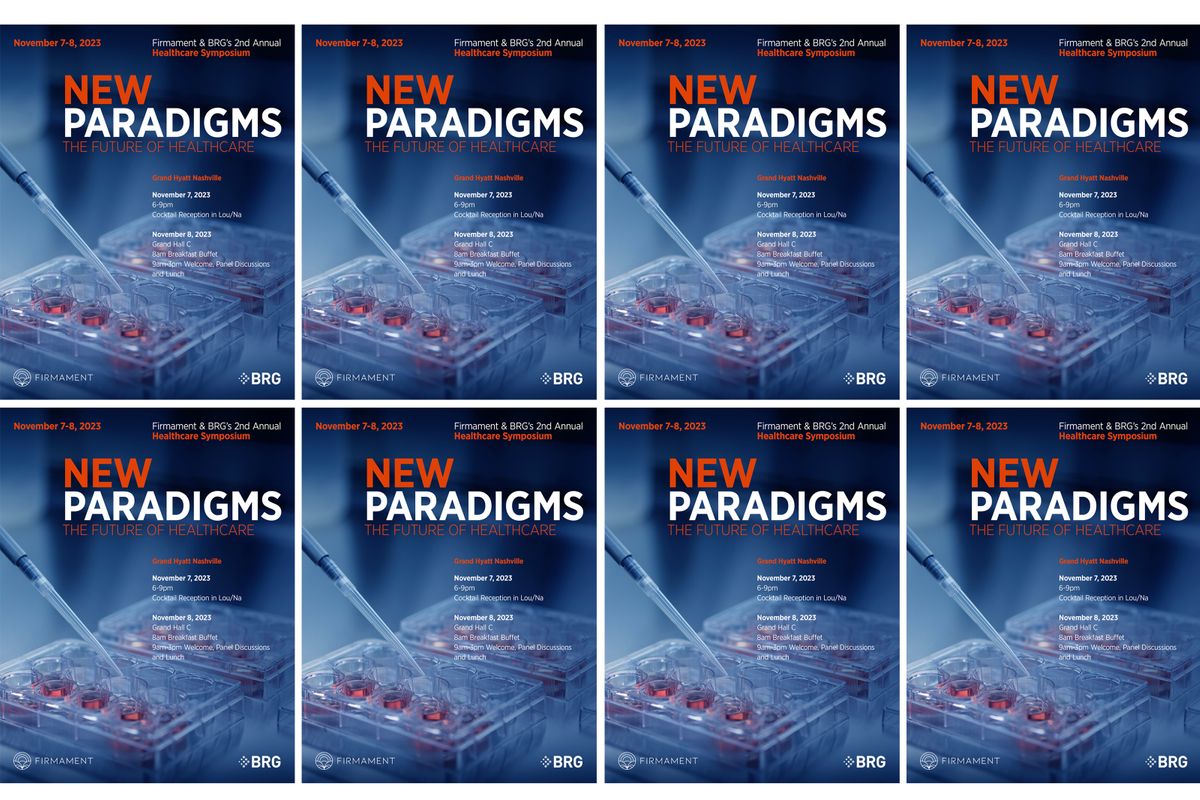
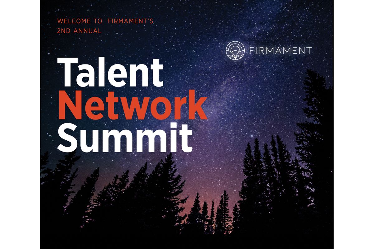
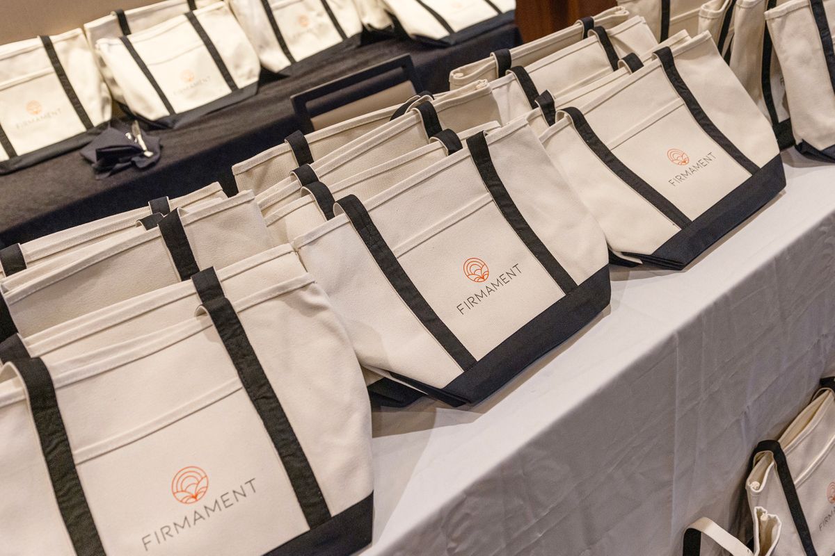
Eric has branded Firmament's conferences and events. From their Supply Chain Symposium to their Healthcare Conference and Talent Network, Eric has used his photographs and bold typography to create the look and feel of each event. Deliverables included on site graphics, digital assets and swag.
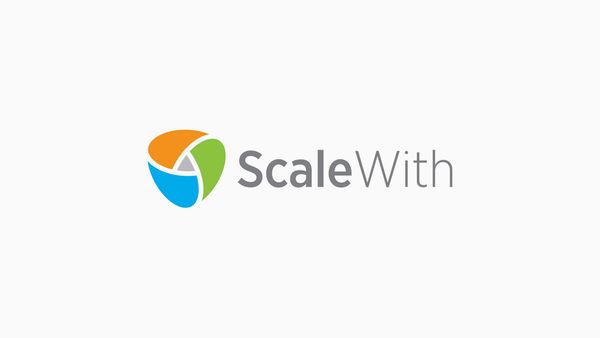
SCALEWITH
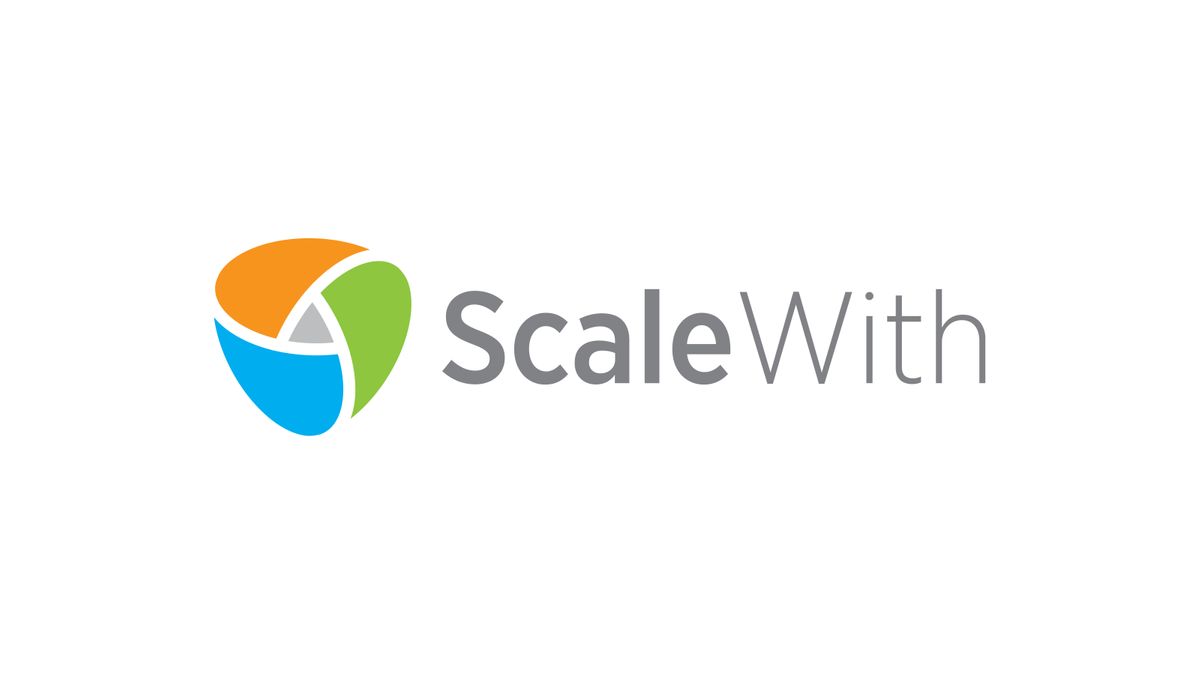
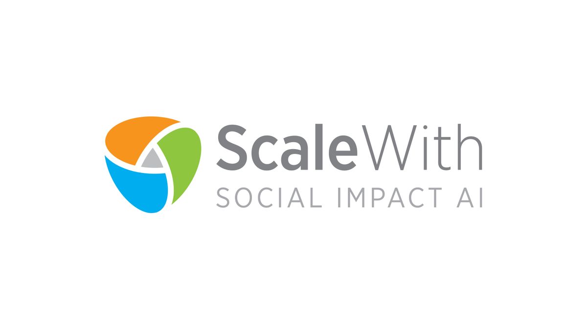
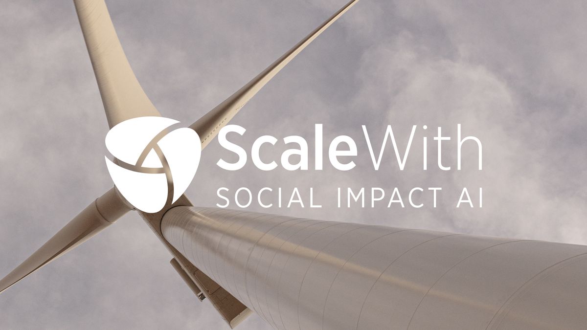
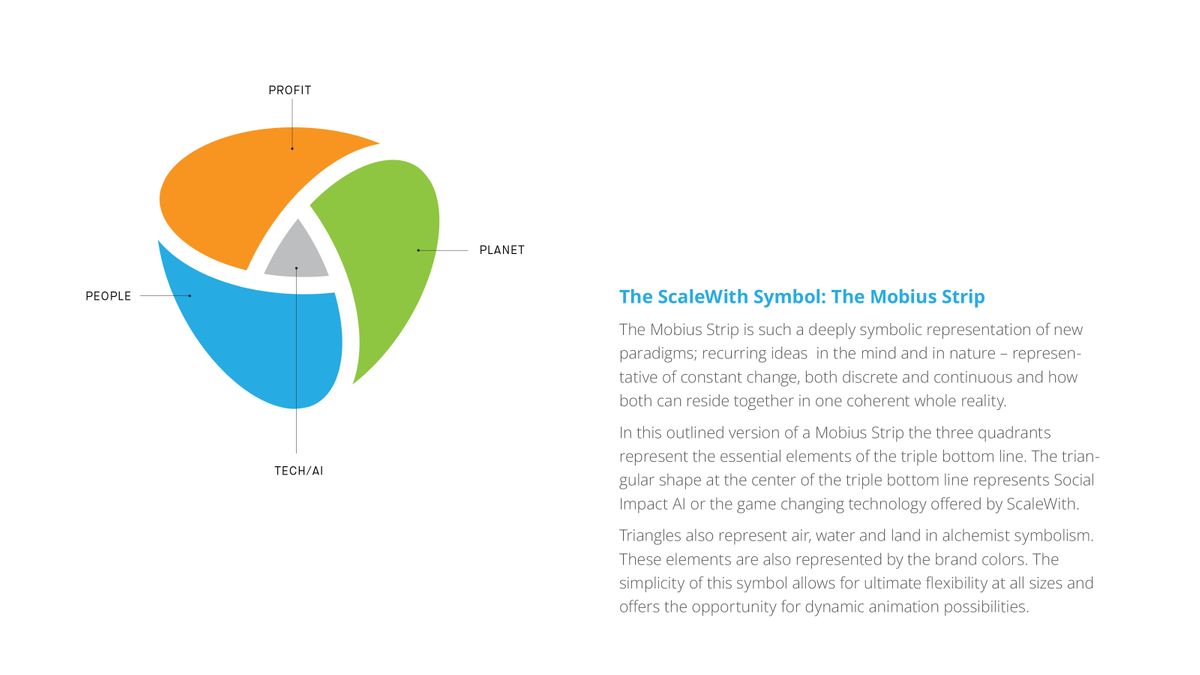
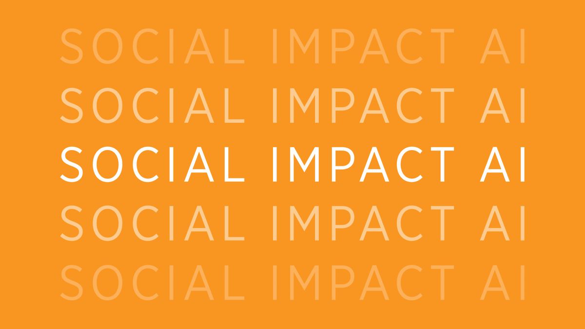
ScaleWith is the smarter way to market, sell & procure, with social impact. It's product, Social Impact AI provides customers with measurement and reporting on social impact, distributes funding to vetted social impact organizations, and shares meaningful stories of social impact to audiences that care most. Eric designed the brand identity for ScaleWith based on the Mobius Strip, a symbolic shape representing constant change and new paradigms.
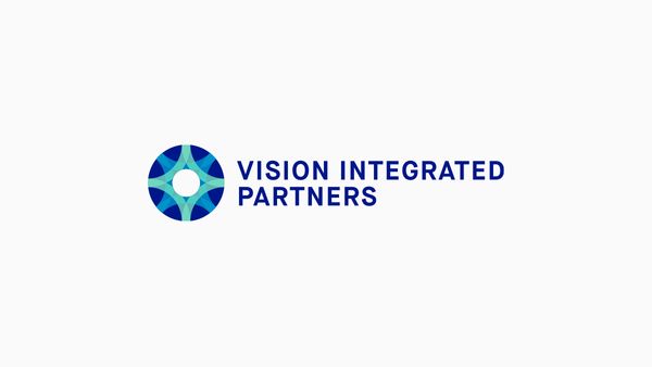
VISION INTEGRATED PARTNERS
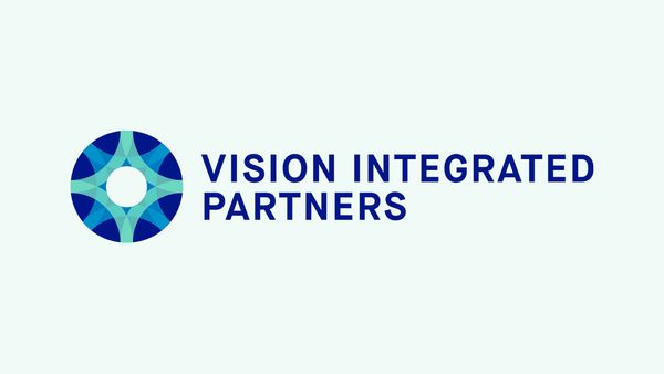

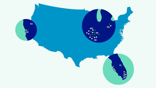
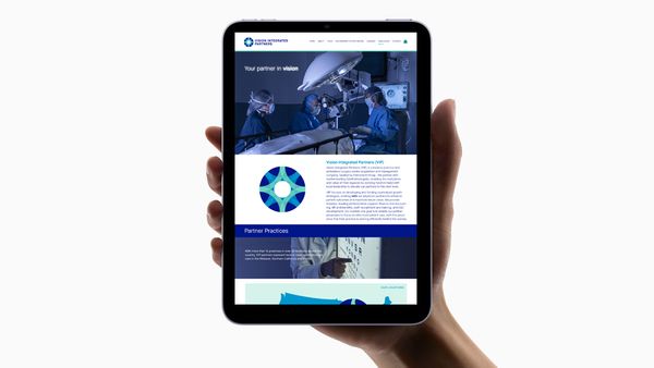
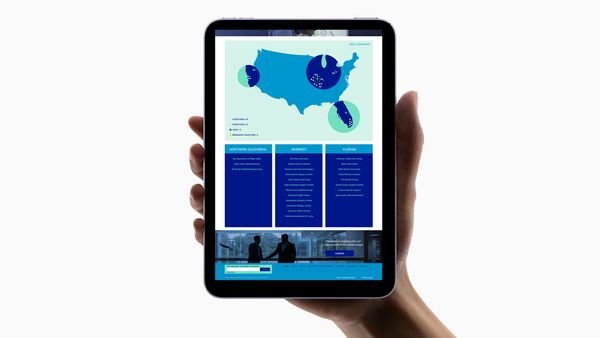
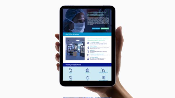
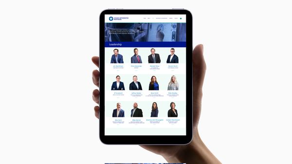
Vision Integrated Partners is a nationwide consortium of ophthalmologic practices. Eric designed a new symbol for the company that is a woven transparent burs – a metaphor for innovation and best practices. The main form is the letter V as well as the Kanji shape for "human" which has been duplicated and repeated to reference a group or network. This final mark resembles an iris. Eric designed the corporate website using images and video that he created as well as a proprietary visual iconographic language.
SPARKLE EXPRESS
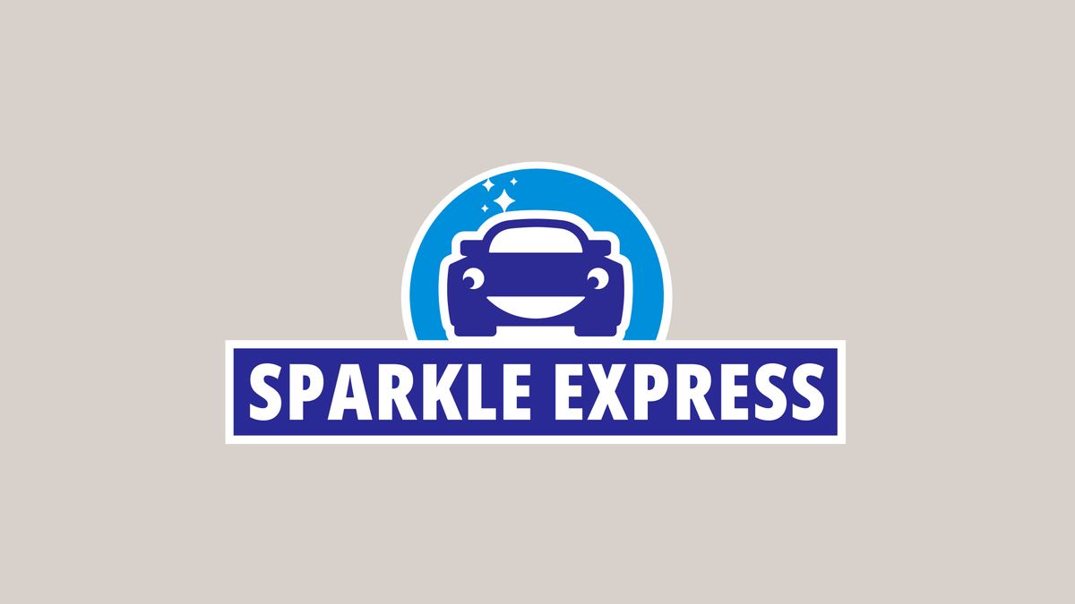
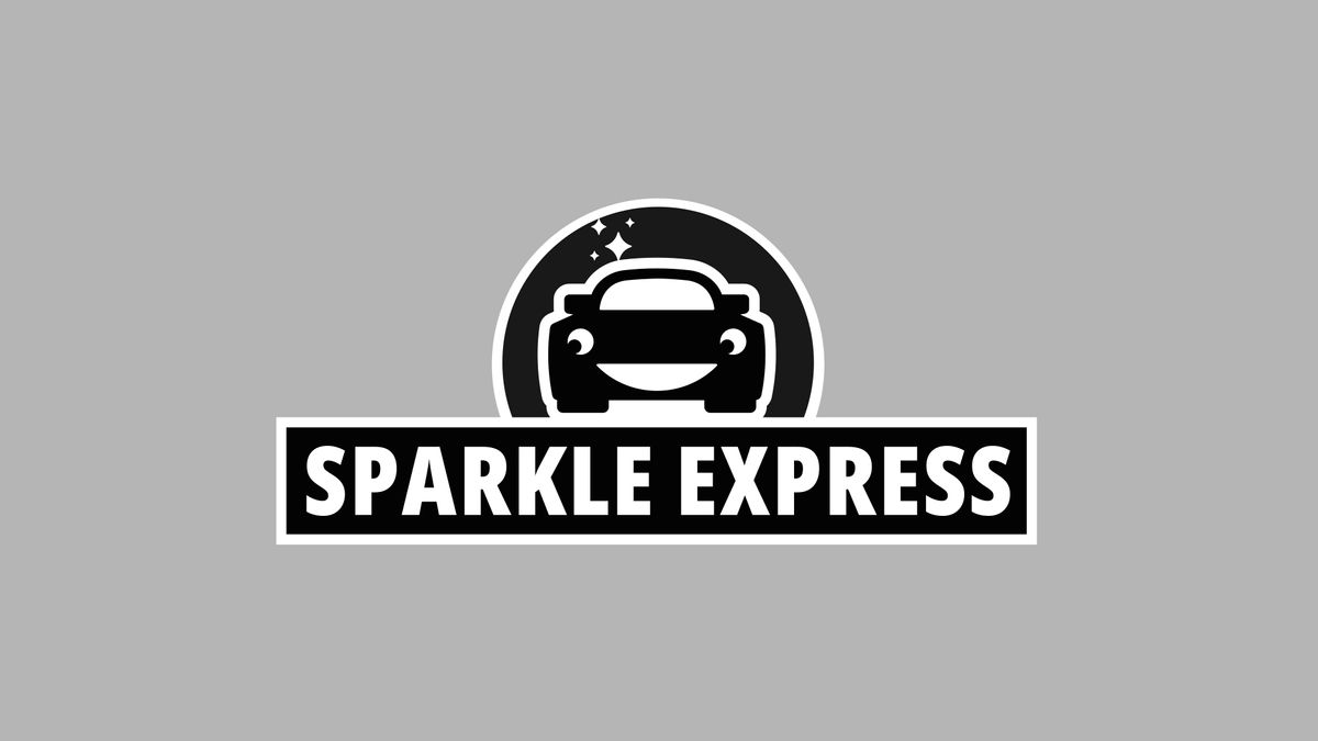
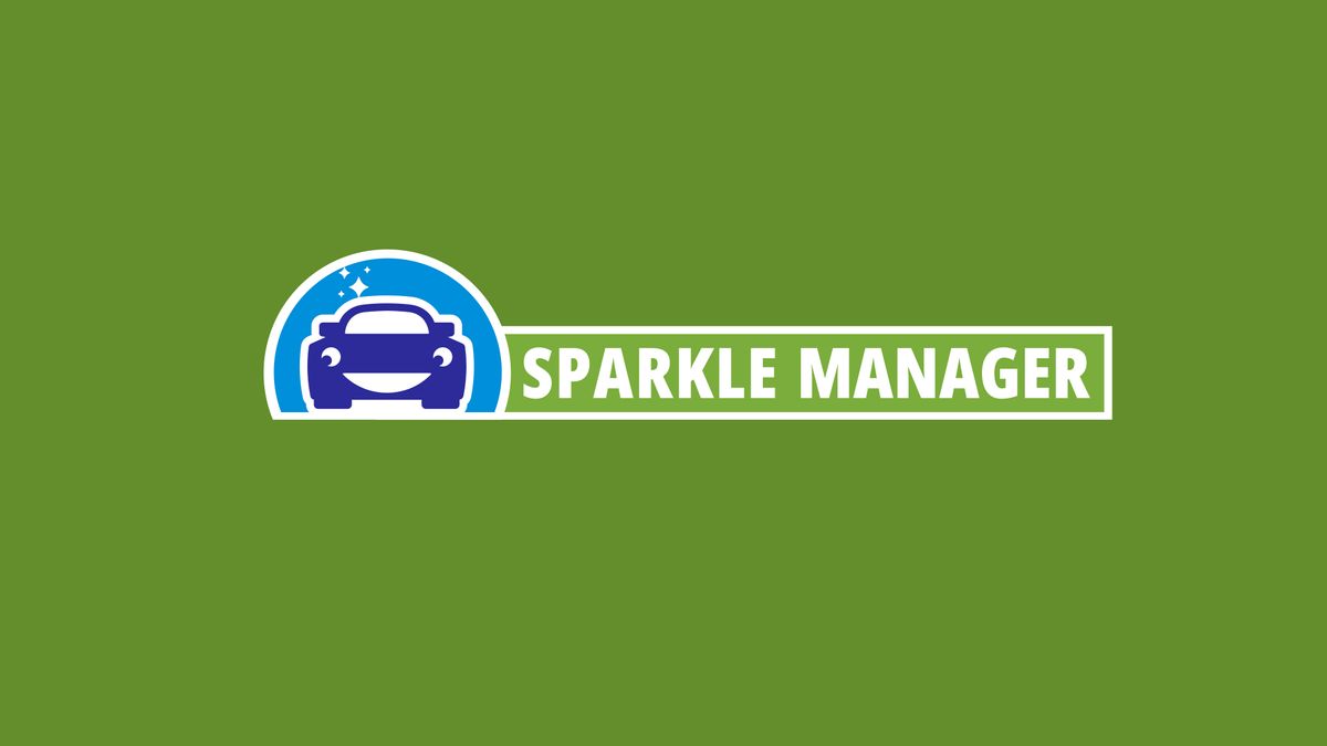
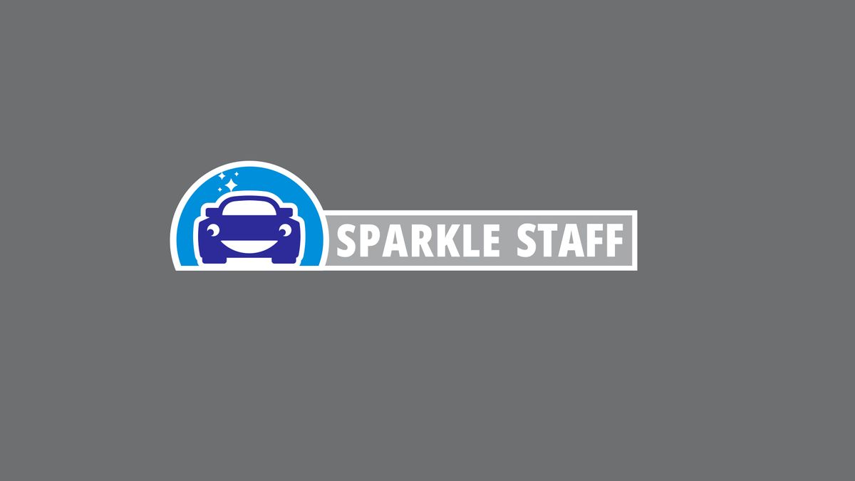
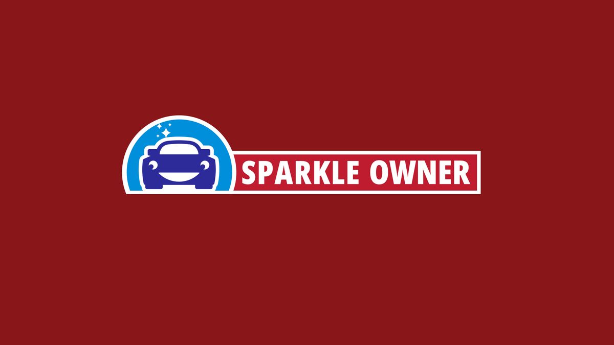
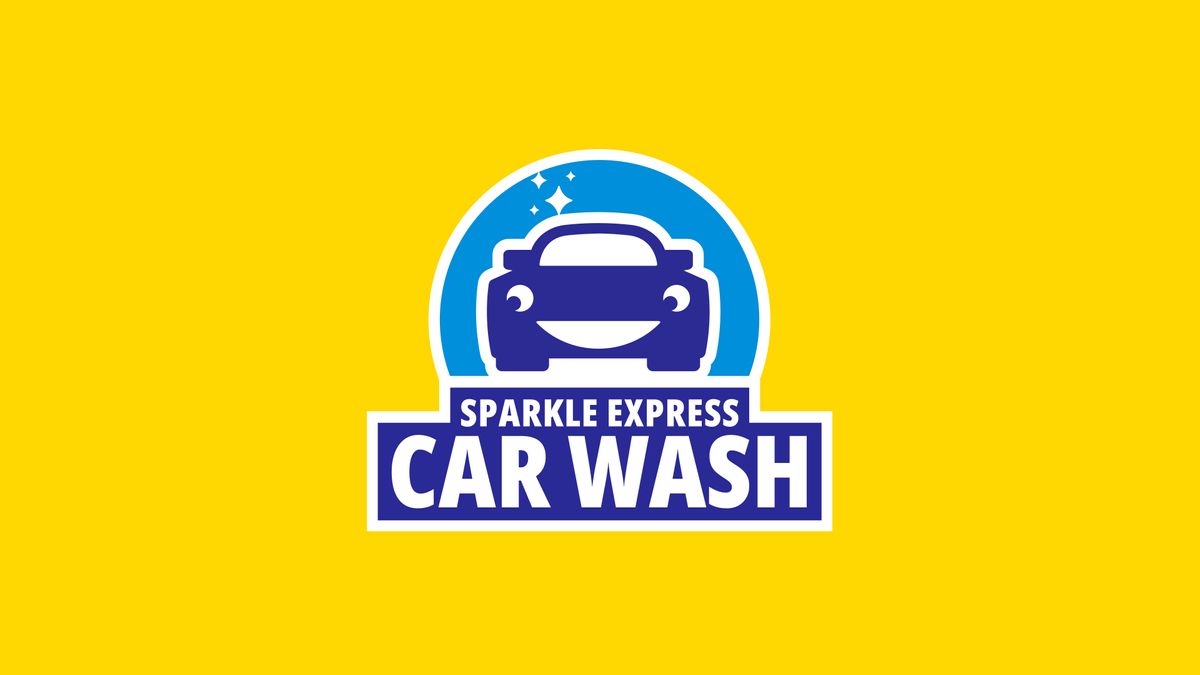
Sparkle Express is an expanding network of car wash franchises located in the midwest and in the southern United States. The new brand identity has an approachable playfulness, but a sophisticated execution. The client wanted to create a character that could serve as a mascot for the brand. Different iterations of the mark were designed for multiple pricing tiers.
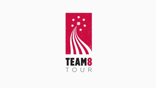
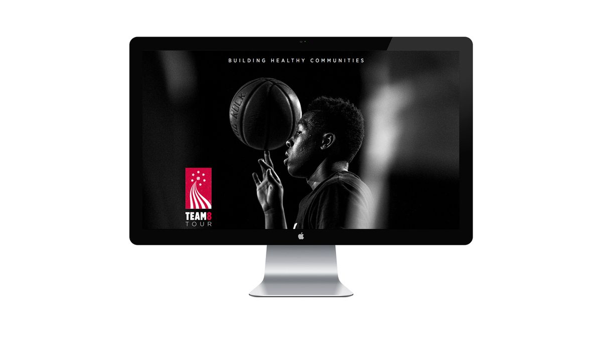
UNITEDHEALTHCARE TEAM 8 TOUR
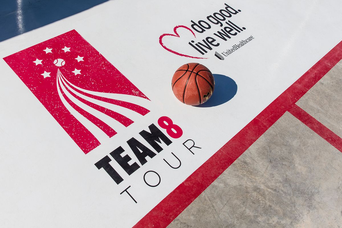
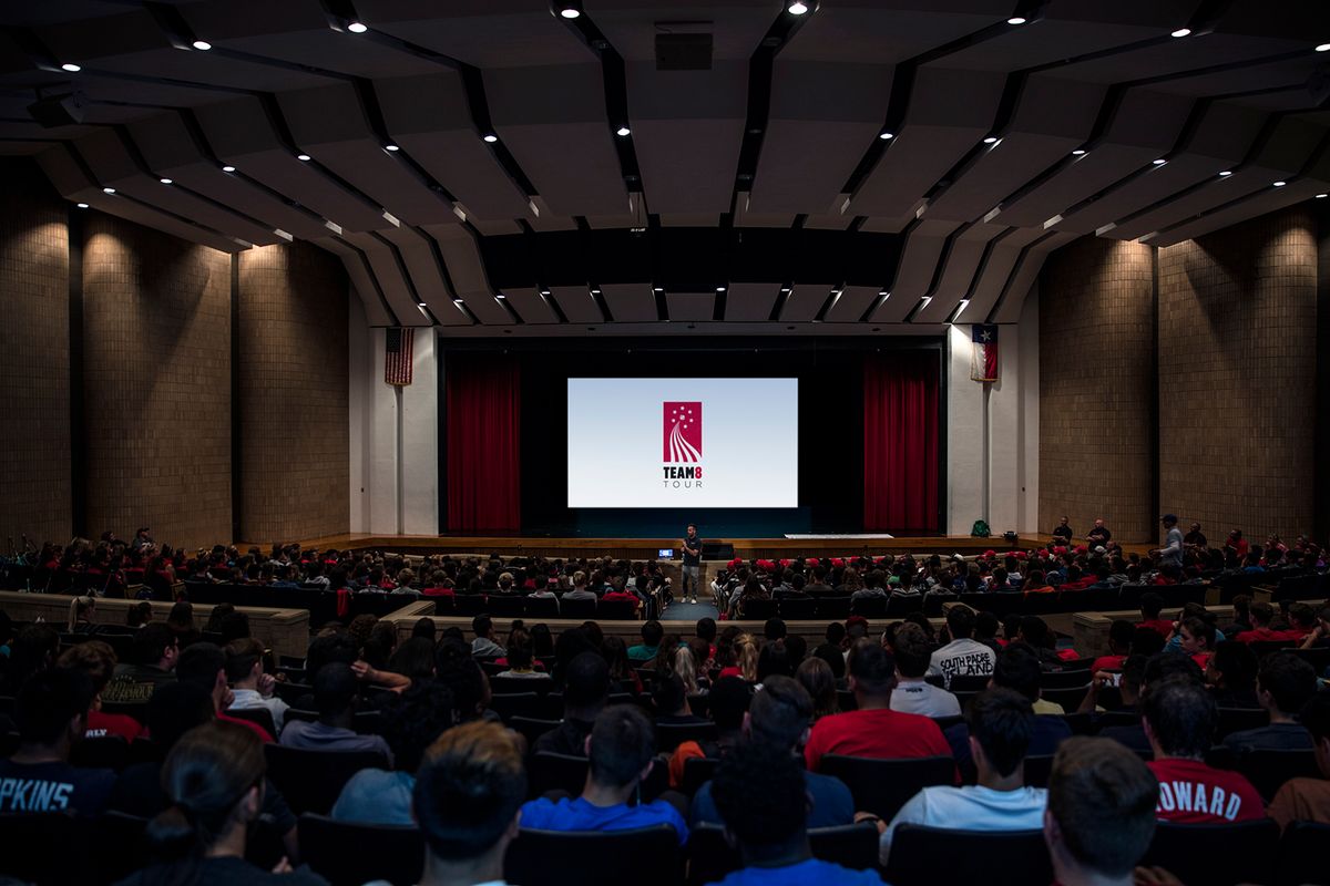
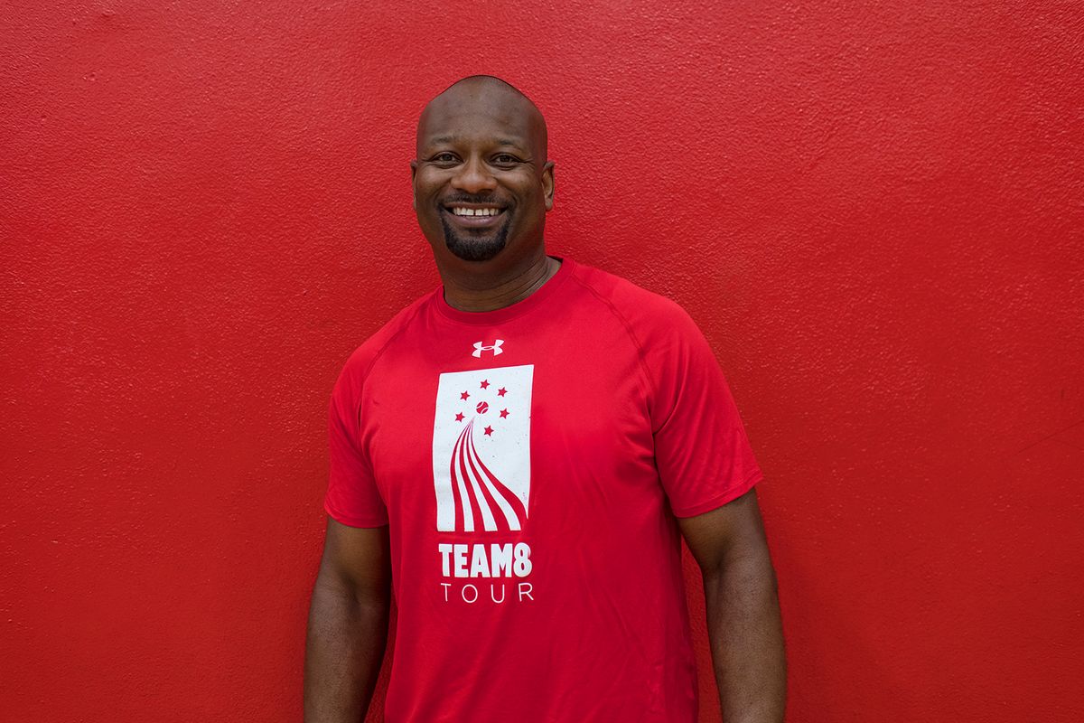
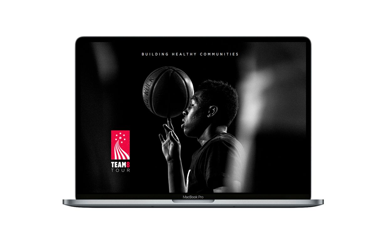
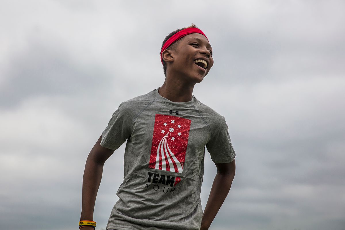
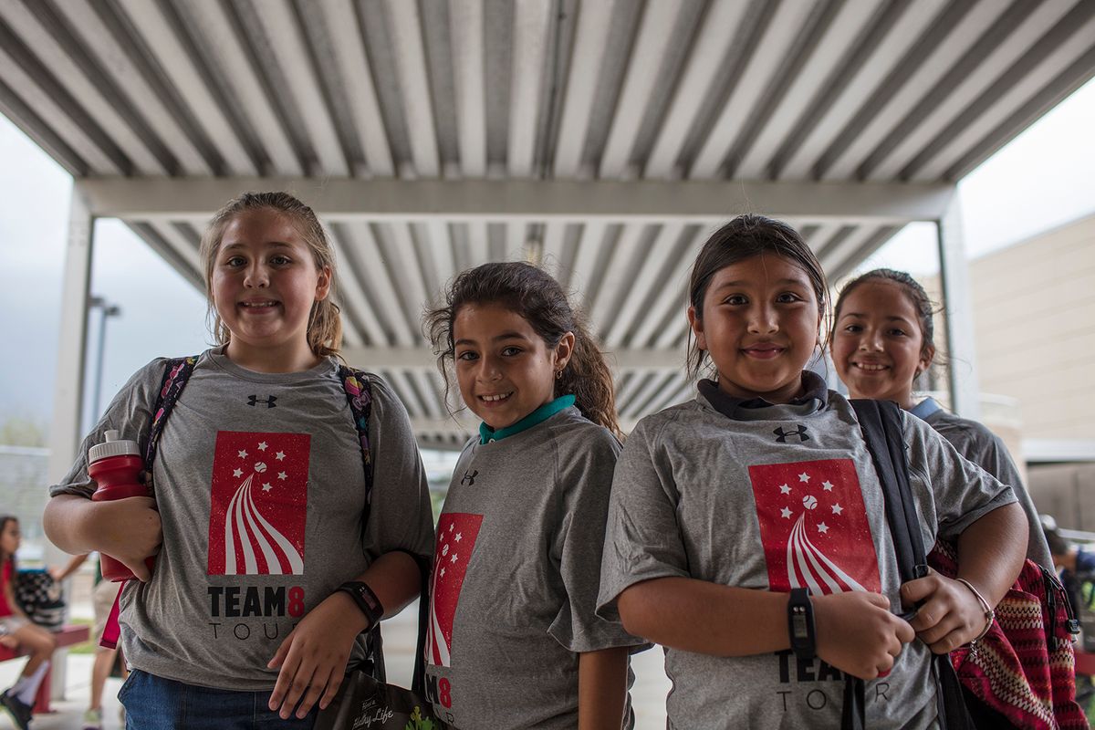
This three year long initiative between Unitedhealthcare, the Cal Ripken Sr. Foundation, CBS and other donors made upgrades to athletic facilities and taught the importance of physical fitness at nearly two dozen deserving schools around the country. Eric created the mark for the initiative that was used on all collateral, videos, merchandise as well as on environmental applications. The ribbon becomes a road signifying the all the organizations that come together on a school makeover and the stars represent the six schools that are awarded the grant each year.
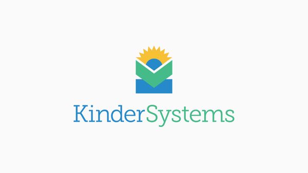
KINDERSYSTEMS
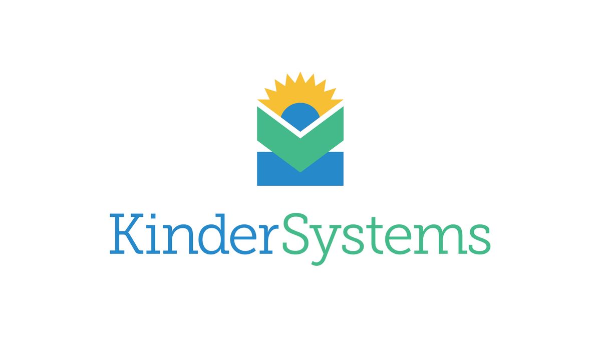
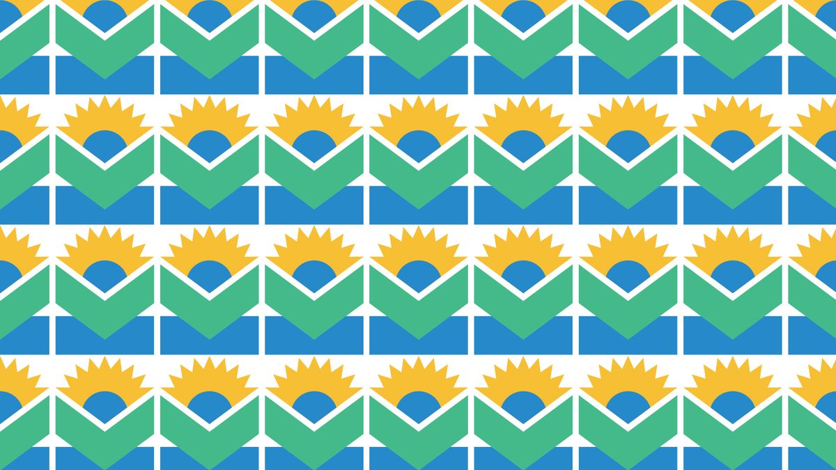
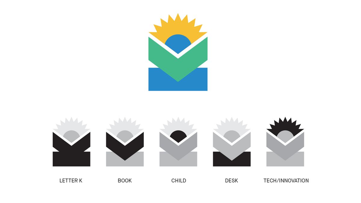
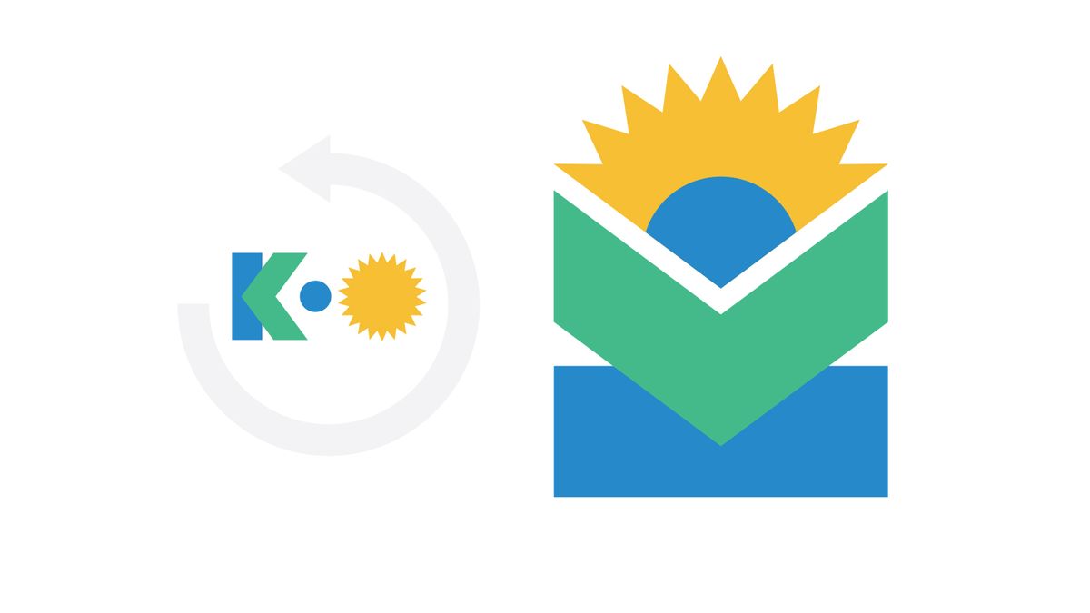
KinderSystems is a software company that creates products for childcare providers to remain subsidy compliant with state agencies. With a new name, the company needed a new graphic identity designed to reflect the importance of supporting pre-k learners. Eric designed a new symbol that consists of a letter K rotated 90 degrees to reveal a child reading a book. The bright color palette maintains sophistication while appealing to the childcare market. This video introduction features company leadership as well as a KinderSystems client who runs a childcare center in California.
DESIGN FOR EVENTS
Transforming Commerce: UNITED NATIONS
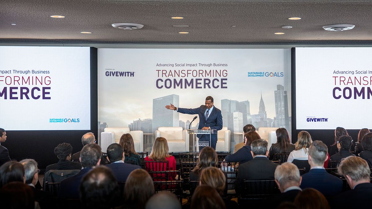
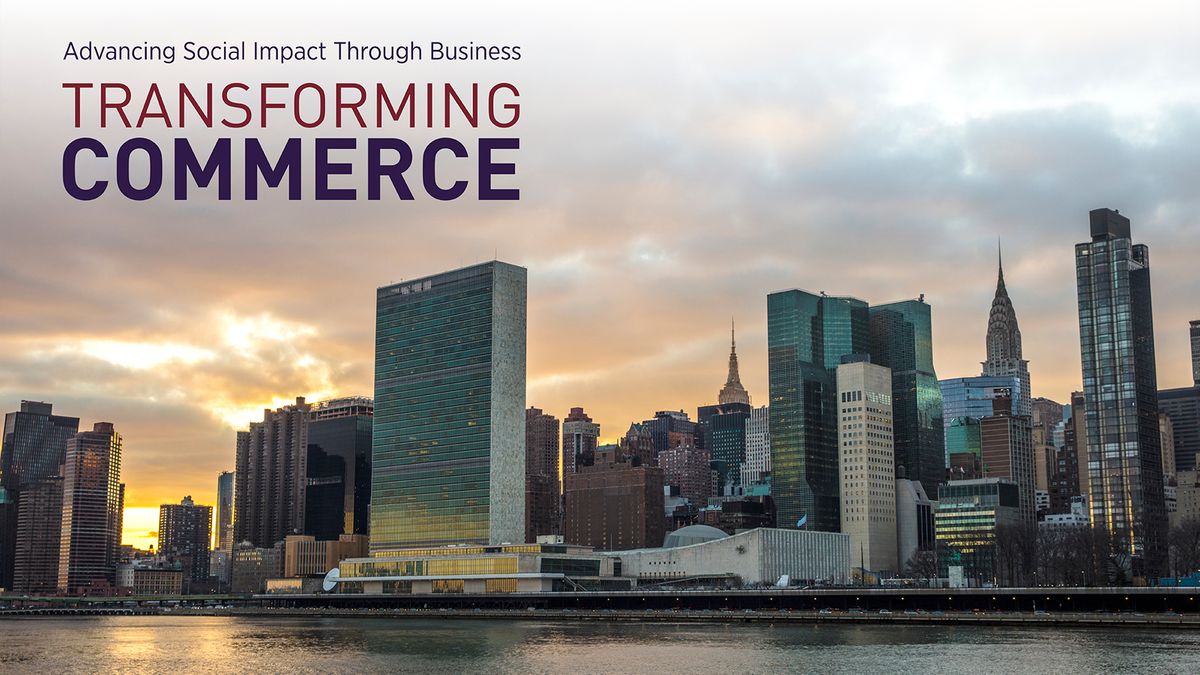
Eric designed the brand identity for a conference on sustainability held at the United Nations in New York with an original photo taken from Roosevelt Island and custom typography. The work appeared at the conference in the form of signage and stage graphics and across multiple pieces of collateral including attendee badges and invitations.
Website Design
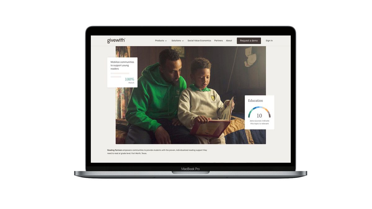
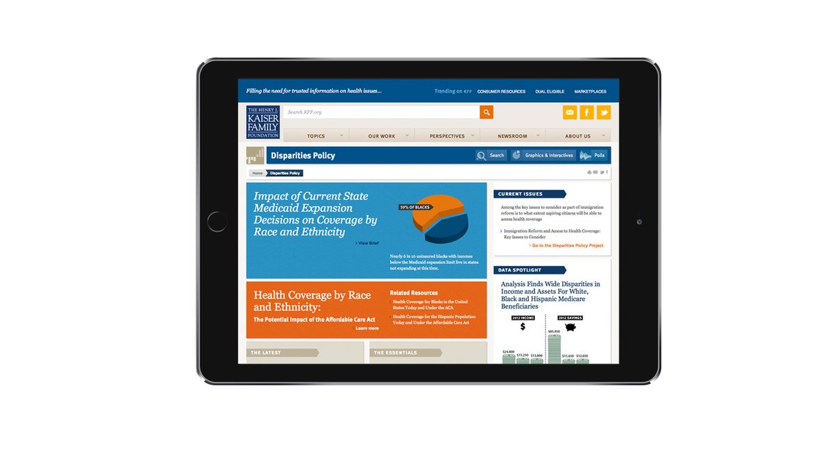
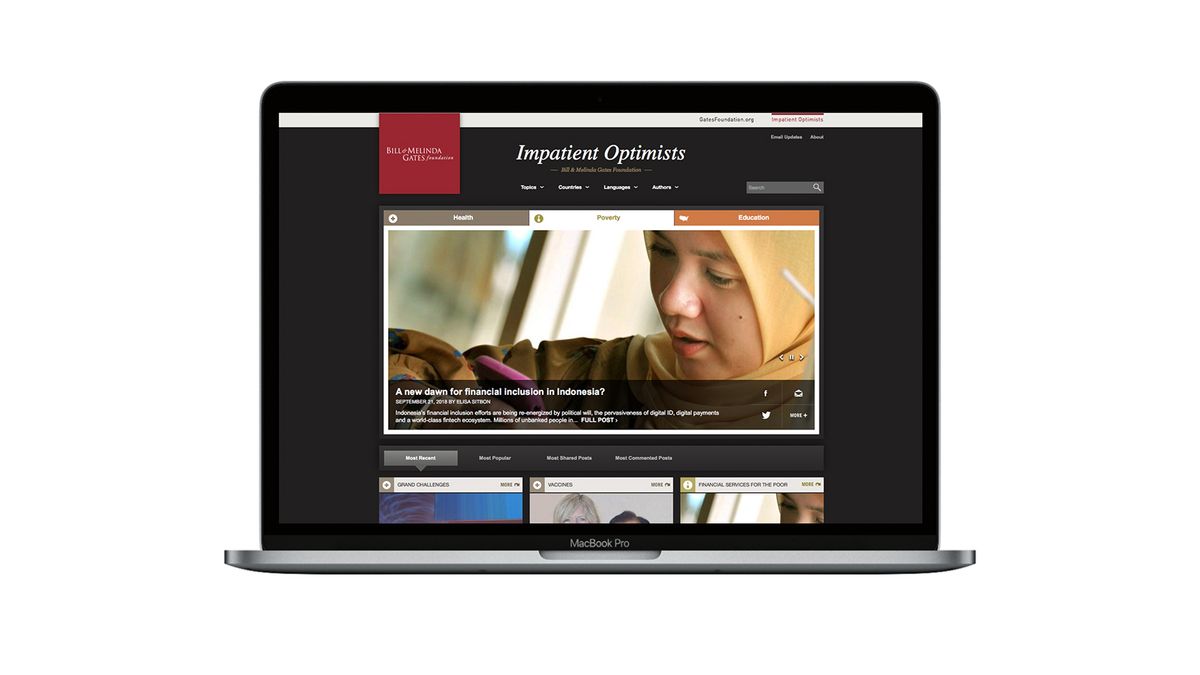
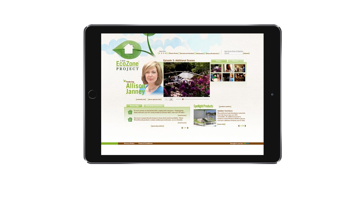
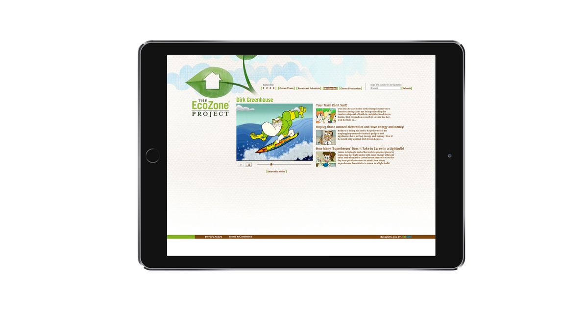
Eric has conceptualized and designed user experiences for organizations such as the Bill & Melinda Gates Foundation, the Kaiser Family Foundation and Givewith.
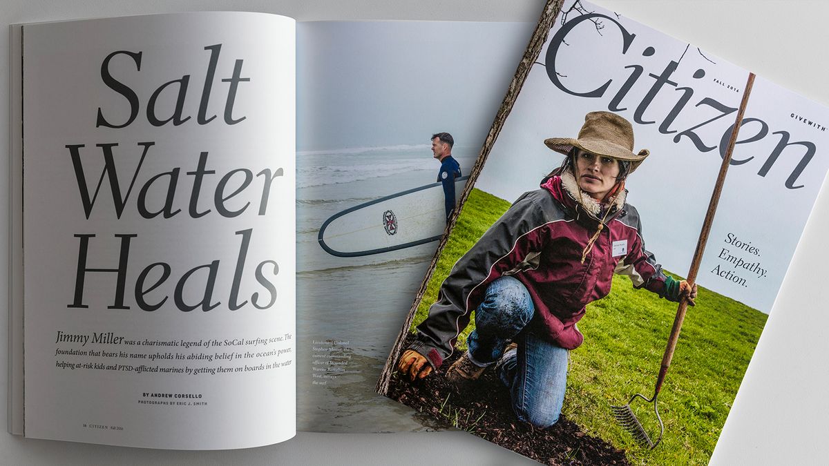
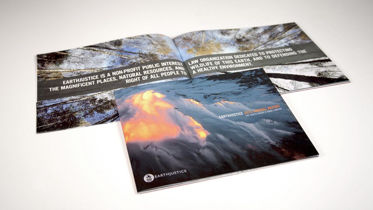
PRINT DESIGN

DESIGN FOR FILM & TELEVISION
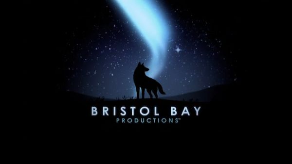
Bristol Bay Productions Animated Logo
"Aliens of the Deep"

"The Texas Chainsaw Massacre: The Beginning"
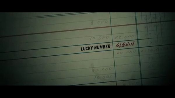
“Lucky Number Slevin”

“The Truman Show” Tru Talk Montage
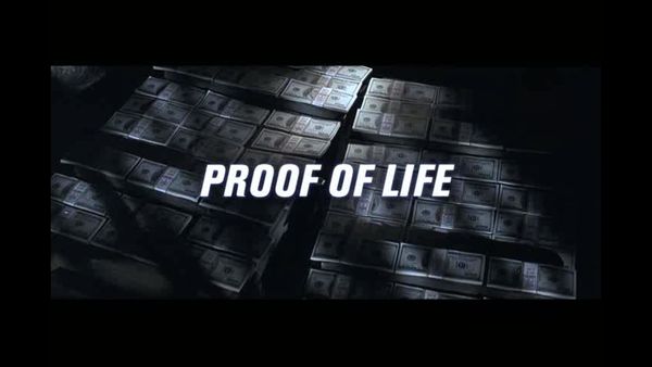
“Proof of Life”

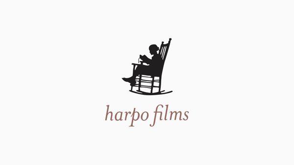
Harpo Films Animated Logo
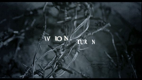
"Wrong Turn"
"Pulse"
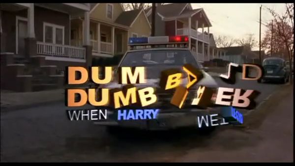
“Dumb & Dumberer: When Harry Met Lloyd”

"Along Came Polly"
“Men With Guns” End Titles
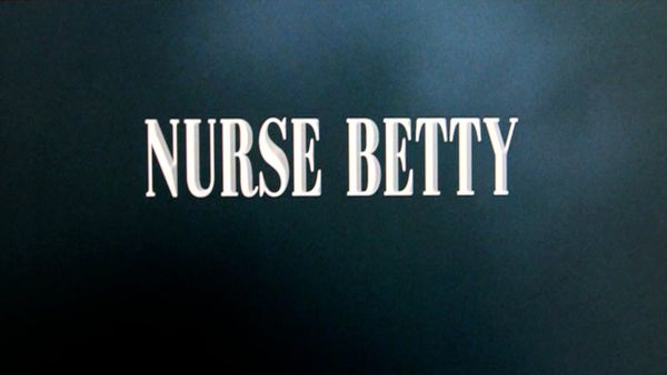
“Nurse Betty” Title Sequence
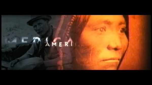
“American Experience” Title Sequence
"The Hot Chick"